Avoid Global State, Co-locate with Uncontrolled Compound Components
With all the best intentions, codebases frequently end up a tangled web of components, abstractions, and global state (managed by a third party library) making the smallest of changes a living nightmare, and maintenance a balancing act.
To solve this, we often hear people talk about avoiding abstractions, but how? Sometimes we need to lift that state to share it, or put that component higher in the tree so multiple parts of the app can control it... right?... 🤔
Over the years, I've thought a lot about colocation and how to effectively apply this principle to the components I build. I began to notice a pattern emerge in my work and I'd like to share it and how it can help ease the aforementioned pains.
But first, let's dive into what colocation means.
What is colocation anyway?
Kent C. Dodds has a great article on the subject where he uses code comments as an example. He details how understanding a piece of code is made easier if the comment that explains it is directly above the code it explains. Anywhere else (e.g. another file) would make the code harder to understand and changing the code could very easily make that comment redundant without anyone realising.
He describes colocation as placing code as close as possible to where it's as relevant as possible.
Things that change together should be located as close as reasonable.
I highly recommend reading his post before continuing... I'll wait 🙂
Colocation in React
One of the common things I realised my peers and I were falling foul of was an overbearing desire to DRY. We have a <Dialog> with some content that needs to be opened from various parts of our app and we think "well, I don't want to put that same content in multiple places, that's not DRY". So we put it in App (or similar), wire up some global state and allow the multiple parts of our app to change that state. The abstractions begin.
Then something dawned on me that we've known all along, but for some reason tend to ignore when wiring applications together. Components are for re-use. Why do we move our content away from the place that controls it and introduce a bunch of global state to re-use something?
What if we applied DRY by bundling re-used pieces of our UI into components that can be consumed in multiple places of the app, instead of controlling a single instance of a component from multiple places.
Here's our first attempt:
I've created a re-usable Dialog component that encapsulates how all the dialogs will look and behave in my app, but then I've created a separate Feedback component for all the feedback content, styling and logic that needs to open from multiple places. It renders Dialog internally.
The first problem you'll notice here though is that users are able to open multiple instances of a Dialog at the same time. We don't want this and since we're trying to stick to the colocation principle, we can't abstract some global state to ensure one at a time either. We need to think how we would achieve this without global state or combining them into one re-used instance.
In this case, what we actually need to do is close the Dialog if someone clicks something outside of it. Let's wire that up.
export const Dialog = ({ onClose, ...props }) => {
  const ref = React.useRef();

  React.useEffect(() => {
    const handleClick = (event) => {
      const dialog = ref.current;
      if (!dialog?.contains(event.target)) {
        onClose();
      }
    };
    document.addEventListener('click', handleClick, { capture: true });
    return () => {
      document.removeEventListener('click', handleClick, { capture: true });
    };
  });

  return ReactDOM.createPortal(<div {...props} ref={ref} />, document.body);
};
https://codesandbox.io/s/avoid-global-state-colocate-demo-2-xtpgw
I've added some document listeners to the Dialog component and so, by trying to think of ways to avoid global state we have managed to colocate the component's requirement of allowing only one to be open at a time.
More complex patterns
I began wondering if there were more complex problems that could benefit from this approach and found myself having to build something that is commonly solved with global state — A properties panel in a sidebar. You know, the type of UIs you see in products like Sketch.
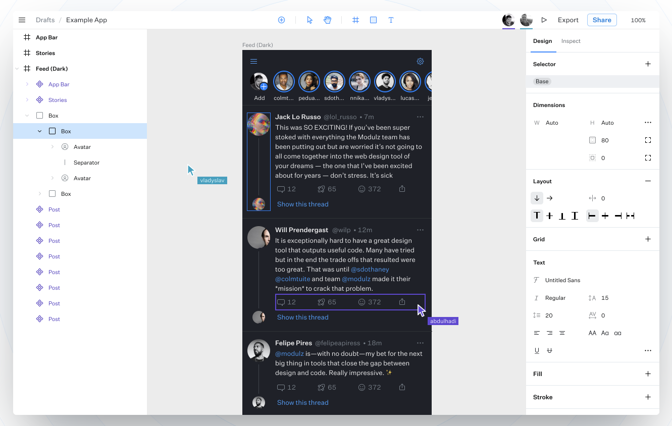
Image of Modulz, an interface design tool.
Those side panels have been the bane of my life in many apps. We render something in Main with properties in a Sidebar and proceed to introduce a bunch of switch clauses determining which properties to display depending on what our global state tells us is selected on screen. We then communicate the property selections back up via global state or prop drilling to change the appearance of the thing on screen. Whew, that was a mouthful.
It's an eyeful in code form too and none of this logic will be tree-shaken. What if someone never renders a Rectangle? That logic will be spread across our app to handle rectangles regardless, just in case.
Solution
I wondered how I could apply colocation to something as complex as this and I figured it out by applying the same thinking as the Dialog.
Why was I trying to re-use a single PropertiesPanel instance when a) I only want to re-use its content that is relevant to my rectangle, meaning b) it is really just the location of it that I want to re-use.
We've already learnt that the first requirement is solved by creating components for each of the property panel parts that the rectangle can re-use but if I co-locate that code with the Rectangle component, it won't be in the sidebar.
Or will it... hang on, the Dialog opened in the middle of the screen regardless of which button I clicked. Portals to the rescue! If we create an empty space for the sidebar that property panels can portal into, colocation is a synch.
Let's build our Rectangle as a Compound Component. This allows different apps to portal the property panel wherever their app requires it because it will be exposed as a separate part.
import {
  Styler,
  StylerSize,
  StylerBackgroundColor,
  StylerBorder,
  // StylerTextShadow - not necessary in Rectangle so will be tree-shaken
} from './Styler';

const RectangleContext = React.createContext({});

export const Rectangle = ({ children }) => {
  const ref = React.useRef(null);
  const [style, setStyle] = React.useState({});
  const [selected, setSelected] = React.useState(false);

  React.useEffect(() => {
    // click outside logic to set `selected` to `false`
  });

  return (
    <RectangleContext.Provider
      value={React.useMemo(
        () => ({ selected, style, onStyleChange: setStyle }),
        [style, selected],
      )}
    >
      <div style={style} ref={ref} onClick={() => setSelected(true)}>
        {children}
      </div>
    </RectangleContext.Provider>
  );
};

export const RectangleStyler = () => {
  const context = React.useContext(RectangleContext);
  return context.selected ? (
    <Styler style={context.style} onStyleChange={context.onStyleChange}>
      <StylerSize />
      <StylerBackgroundColor />
      <StylerBorder />
    </Styler>
  ) : null;
};
The Rectangle uses a custom built Styler component that returns a style object based on the properties rendered inside of it. We update the style attribute on the rectangle when those properties change.
Before we can consume it in our Sketch clone we need a SidebarPortal component that will wrap our RectangleStyler and render it in the sidebar.
const SidebarContext = React.createContext([]);

export const SidebarProvider = (props) => {
  const sidebarState = React.useState(null);
  return <SidebarContext.Provider value={sidebarState} {...props} />;
};

export const Sidebar = () => {
  const [, setSidebar] = React.useContext(SidebarContext);
  return <div ref={setSidebar} />;
};

export const SidebarPortal = ({ children }) => {
  const [sidebar] = React.useContext(SidebarContext);
  return sidebar ? ReactDOM.createPortal(children, sidebar) : null;
};
Then we consume it all:
// Main.js
export const Main = () => (
  <main>
    <Rectangle>
      <SidebarPortal>
        <RectangleStyler />
      </SidebarPortal>
    </Rectangle>
  </main>
);

// App.js
export const App = () => (
  <div>
    <SidebarProvider>
      <Main />
      <Sidebar />
    </SidebarProvider>
  </div>
);
And voilà! Clicking the Rectangle opens its properties in the sidebar. But wait. When we interact with the styler in the sidebar, it closes. You can try it all here here.
This is because of the click outside logic. We're using rectangle.contains to check if the element being clicked is outside the rectangle and the styler is outside. It's in the sidebar.
Fortunately, React has a really handy feature that's rarely praised but is super useful when colocating like this. React events bubble through the React tree regardless of where they're rendered in the DOM. We can take advantage of this to prevent clicks in the sidebar from closing the styler.
export const Rectangle = ({ children }) => {
  const ref = React.useRef();
  const [style, setStyle] = React.useState({});
  const [selected, setSelected] = React.useState(false);
  const isClickInsideRef = React.useRef(false);

  React.useEffect(() => {
    const handleClick = () => {
      if (!isClickInsideRef.current) setSelected(false);
      isClickInsideRef.current = false;
    };
    document.addEventListener('click', handleClick);
    return () => {
      document.removeEventListener('click', handleClick);
    };
  });

  return (
    <RectangleContext.Provider
      value={React.useMemo(
        () => ({ selected, style, onStyleChange: setStyle }),
        [style, selected],
      )}
    >
      <div
        style={style}
        ref={ref}
        onClick={() => setSelected(true)}
        onClickCapture={() => (isClickInsideRef.current = true)}
      >
        {children}
      </div>
    </RectangleContext.Provider>
  );
};
We set an isClickInside boolean via the React click event. This will be true if the click is in the RectangleStyler because it will be a child in the React Tree and its click will propagate to the Rectangle.
This approach will reduce a bunch of complexity in your codebase. No more switch statements in a PropertiesPanel instance. No more global state connecting the style choices to the rectangle. Everything will be tree-shaken if the Rectangle is rendered conditionally with React.lazy. It also avoids unnecessary re-renders in other components—if you're changing the RectangleStyler, only the rectangle parts re-render.
Going further
We're rendering this rectangle all the time at the moment but in a Sketch-like app, this would usually get added via an "Add rectangle" button. We could add that logic to our App using some state that determines whether the Rectangle should render or not but that means the logic could end up completely disconnected from this component and we'd lose colocation again.
We can do more by encapsulating the Trigger as part of the Rectangle component and re-use the portal technique to render a Rectangle in Main when it is clicked.
I'm not going to dive into the details of this example as it mostly re-uses techniques I've already shared but here's the finished product.
I've added some backspace logic here too so you can remove a selected rectangle, however, we can only add one Rectangle at a time for the moment. This can be solved with render props, but that's one for another day. Feel free to poke me on twitter if you need help understanding any of the above.
Now, if you need to make a small change to any rectangle related properties or logic, simply open the Rectangle component. It's all there. No more crawling through various parts of your app to reason about it, and your changes won't impact any other feature.
Imagine how the process will look if you later need to remove the rectangle feature. With the instance re-use and global state approach we would have originally taken, this would be a mammoth task to pick out all the rectangle related logic throughout our component tree. However, with colocation we remove references to <Rectangle /> along with Rectangle.js and we are done 🎉
Uncontrolled Compound Components
I've begun referring to this colocation technique in React as the Uncontrolled Compound Component pattern. These are components that do everything associated with their concern without you needing to wire them up manually to use them. No state, no refs. Everything Just Works™.
We've taken this approach on the Radix Primitives team at Modulz to encapsulate the accessibility and functionality requirements of common web components so you can get up and running quickly.
The following demonstrates how you could apply the colocation principle using our Dialog as the Feedback component.
import * as Dialog from '@radix-ui/react-dialog';

export const Feedback = ({ children, ...props }) => (
  <Dialog.Root>
    <Dialog.Trigger asChild>{children}</Dialog.Trigger>
    <Dialog.Content {...props}>
      <h2>Thoughts?</h2>
      <form>
        <textarea />
        <button>Submit feedback</button>
      </form>
      <Dialog.Close>Close</Dialog.Close>
    </Dialog.Content>
  </Dialog.Root>
);

// render (
// 	<Feedback>
//		<PrimaryButton>Feedback</PrimaryButton>
//	</Feedback>
//
//  ...
//
// 	<Feedback>
//		<SecondaryButton>Feedback</SecondaryButton>
//	</Feedback>
// )
Conclusion
Colocation can significantly reduce complexity. I really hope this has inspired you to apply the principle in your applications by favouring component re-use over instance re-use.
And on that note, all <Feedback /> welcome 👋